
ショコラ
HTML フレックスボックスについて
サンプルを用意しておきます。

もっさん先輩
フレックスボックスを使ってみました。
<html>
<body>
<style>
.flexbox {
  display:flex;
  flex-flow:row wrap;
  width:300px;
  background-color:#000;
}
.child {
  width:50px;
  height:50px;
  background-color:#F00;
  margin:10px 10px 10px 0;
}
</style>
  <div class="flexbox">
    <div class="child">A</div>
    <div class="child">B</div>
    <div class="child">C</div>
    <div class="child">D</div>
    <div class="child">E</div>
    <div class="child">F</div>
  </div>
</body>
</html>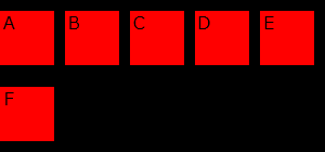
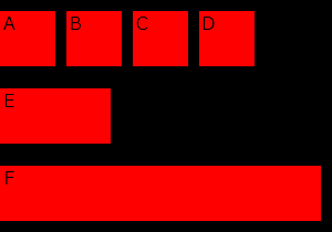
ウィンドウを広げると、メディアクエリが反応して、Fのボックスが横に100%で開くサンプル。
<html>
<body>
<style>
.flexbox {
  display:flex;
  flex-flow:row wrap;
  width:300px;
  background-color:#000;
}
.child {
  width:50px;
  height:50px;
  background-color:#F00;
  margin:10px 10px 10px 0;
}
.child:nth-child(5) {
  width:100px;
}
@media (min-width:1000px) {
  .child:nth-child(6) {
    width:100%;
  }
}
</style>
  <div class="flexbox">
    <div class="child">A</div>
    <div class="child">B</div>
    <div class="child">C</div>
    <div class="child">D</div>
    <div class="child">E</div>
    <div class="child">F</div>
  </div>
</body>
</html>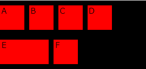
↓下はブラウザを広げたところ
以上